Campbell’s Foodservice
Made to Serve
How we revitalized a beloved brand to highlight its commitment to real, nutritious food for operators and their guests.
The Challenge
Despite a valued and nostalgic brand name, Campbell’s Foodservice faced declining relevance and limited product line awareness. Additionally, consumer demand for cleaner labels conflicted with preconceived notions about some of Campbell’s most iconic products: canned soups.
The Clarity
Campbell’s is committed to bringing delicious, nutritious food to the many by better serving operators so they can better serve their guests.
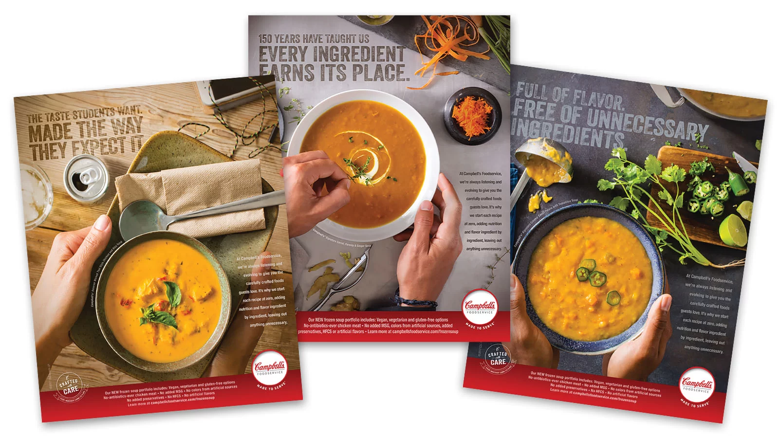
The Transformation
We reignited the company’s century-old founding principle of democratizing real food. That philosophy was encapsulated through a new brand promise: Made to Serve.
A compelling brand story connected Campbell’s past with the present. For more than a century, they have been bringing real, delicious, nutritious foods to the many—a mission that continues today and into the future.
A new visual identity featured food at the forefront. Hands brought in humanity, and the tone was meant to capture humility and empathy.
The brand came to life both internally and externally through wall graphics for Campbell’s Foodservice headquarters and an enhanced tradeshow presence.
A refreshed website served as a platform for both the brand story and helpful product information chefs and operators could reference with ease.
Results and Impact
1,906,824 impressions were achieved for the Made to Serve brand campaign in its inaugural year.

You May Also Like
How we helped top brands stand out in foodservice

How we positioned Butterball as an invaluable resource for millennial foodservice operators.
How we turned an industry leader into an approachable partner.